This map was found on an internet blog. It shows levels of internet traffic around the world. Each country connects to other countries with varying degrees of color depending on the magnitude of internet traffic for each connection. The colorless countries have little to no internet traffic as they are still developing nations.
I think the map is interesting because it gives viewers a good sense of how connected the world is currently. Some nations are still developing and are left colorless to show how they are, in a sense, cut-off from the rest of the world. The traffic lines also point out the relationships between countries by showing the frequency of connections. We can gain insight about what the world could do to improve its equality and help speed up the progress of developing nations.
Map 2
This next map was found on Wikipedia under the Ring of Fire entry. It shows the tectonic plates and their names around the world. Their conflicting edges are also pointed out with red arrows to describe where earthquakes and active volcanoes most often occur.
I think this map is very interesting because it is relevant to the recent events in Japan. Many scientists blame the Ring of Fire for the 9.0 magnitude earthquake that hit Japan in early March. This map helps to understand why the Ring of Fire exists. The pacific plate conflicts with many other tectonic plates causing earthquakes and volcanic eruptions. I also find it interesting that below the mainland and the sea, everything is resting on large plates. It is almost as if there is a second, hidden world map.
Map 3
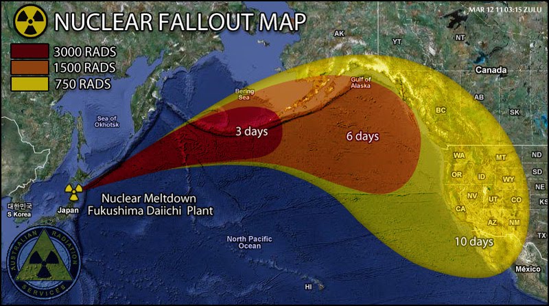
 (source: https://blogger.googleusercontent.com/img/b/R29vZ2xl/AVvXsEhdLCtLuc3se40xYdFxJ9KEyvDnUey9hyphenhyphenYLXCugJP2Kt0c7yds0rMhPefTKN_YN8_rF4TUNWS7s74n9SURenX-afOKiw8MmTdrggH0grmKyEEriF0y7D_nF4DOl7tyBSR4YrdKLSkMLBAA/s1600/Fallout-Map-From-Japan-Nuclear-Plant.jpg)
This map was taken from another internet blog and shows the spread of nuclear fallout from the nuclear power plant meltdown in Japan. It also gives the levels of radiation as the fallout spreads and diffuses across the Pacific Ocean.
I think this map is interesting because it has real life consequences and is relevant to the current state of the world. Note that the map is outdated and was released as a prediction soon after the earthquake. The fallout did not affect North America as much as this map had predicted. However it still demonstrates how nuclear fallout from disasters could affect other countries across the globe. Effects from Japan's earthquake could be felt all over the globe in a short time. Maps like this help us predict consequences and help others plan for unexpected events like earthquakes.